This post will be about colors and emotions. Especially about modern relations between colors and emotions.
Old School?
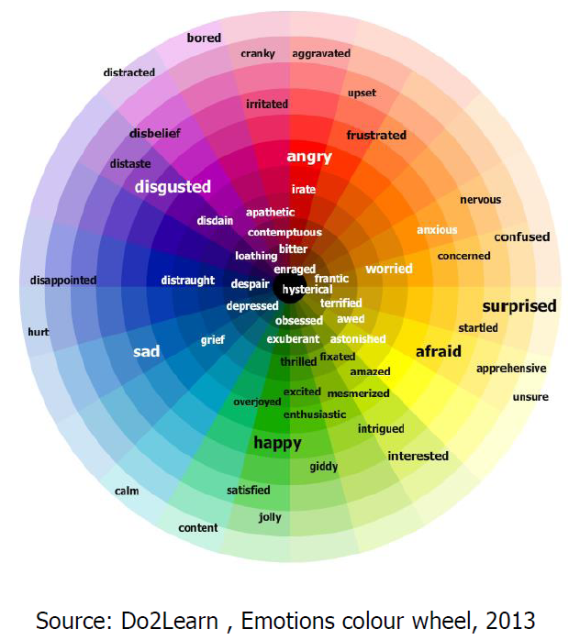
Take a look at this color wheel of emotions, it is available in high resolution and better quality online as PDF.
Questions
Let’s question several colors exclusively, e.g. Red, Orange, Violet, Blue, Yellow…
Red
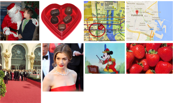
The color wheel says it is about feeling angry, irate, frustrated, aggravated. Really? What about Christmas cards and stripes? They are all red. Santa Claus is all red. St Valentine stuff is all red and it is about love. All wedding packages are using red for love and passion. On metropolitan maps you have “You are here” in red. On Google Maps you have red location balloons. Women’s lips are red. Children character Mickey Mouse is red. Strawberries, watermelon, cherries, apples, pomegranates are red. There are so many positive reds in the nature, society, technology etc. and they are no way negative. Instead they are pretty positive.
Orange, Yellow
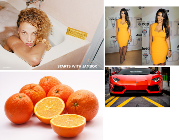
The color wheel says orange is nervous, worried, concerned, confused; yellow is afraid, apprehensive… Let’s see what we have and use in orange and yellow and check out emotions. Oranges are no way nervous or concerned, it is common daily juice. Yellow dresses are cool. Orange Lambo is standard color and all good with emotions.
Violet, Blue
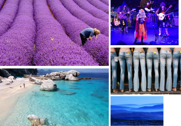
The color wheel says violet is disgust, distate, disappoint; blue is sad, grief. Let’s check it around us. What about violet fairy? Violet lavender fields, violet blossom? Blue is common on concerts, check out pleasant folk music by Blackmore’s Night… Horizon is often blue and there is nothing sad about it.
Conclusion
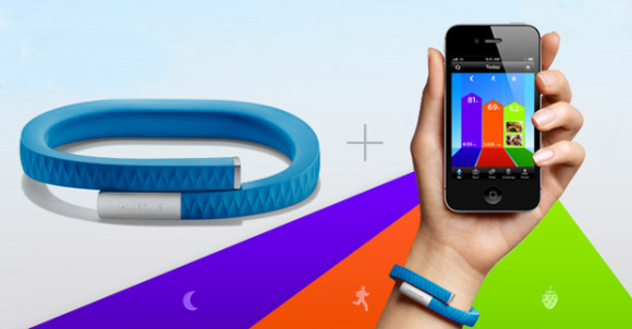
The perception of colors is different today, seems it was different for years. That emotion color wheel is wrong. There are so many real life cases when vivid violet, orange, blue are used and it looks positive, emotionally positive. Check out cutting-edge wearable products from Jawbone, ensure there is nothing wrong with the colors at all. Emotions are driven by combinations, via balance, via synergy, but never by damn single color.
PS.
Don’t know how to add more vertical space before headers. WordPress usability sucks.